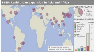
 BBC News provides an interesting interactive map on urban growth around the world. By moving a slide bar along a dateline, you can graphically compare urban population from 1955 to the projected density for 2015. Mouse over a plum-colored dot and a box pops up with the population statistic by city. I grabbed two charts. The first from 1985 (above) shows:
In the 1980s Asia sees a resurgence of growth in cities as urbanisation gathers pace again in China. Growth rates have slowed globally, however, particularly in Latin America, although they remain high in Africa. There are now [2 billion] urban dwellers worldwide. The worlds' biggest city, Tokyo, has reached [30 million].Fast forward 20 years later to 2015 and the map looks like this...
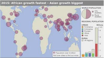
The world's urban population is expected to hit [4 billion] between 2015 and 2020, about the same time as China becomes more than 50% urbanised. Most of the growth will happen in Africa and Asia, with Africa's urban population growing fastest in percentage terms and Asia seeing the biggest volume of growth.Holy cow, people. Within 20-25 years, about one generation, the urban population doubles. Think of the implications: economics, transportation, real estate, health care, infrastructure such as water and energy, and more. What are we going to do with all the people?
SOURCE:UN DESA(2005)






|